Charts🔗
Charts provide eye candy for your users. Here's a few samples of how they currently look:
Charts involve 3 main keywords, which are:
*chart: Type the*chartkeyword and optionally provide a title (e.g.,*chart: My Chart).*type: Define what kind of chart you'd like to plot. For now, we have "bar", "scatter", and "line".*data: Provide the x- and y-values of the data to be charted.
Optional keywords include:
*color: Provide the RGB code to the color you'd like, or for basic colors write the name (e.g.*color: red)*xaxisand*yaxis:- Set a
*minand*maxvalue for the y- and x-axes of your chart - Use
*position: leftor*position: rightto choose where to display your y-axis, and*position: topor*position: bottomto specify where the x-axis should be displayed - Add
*ticksto improve the labels displayed on your axes
Scatter charts also have a an additional, optional keyword:
*rollovers: Optional text that pops up when the user rolls their mouse over any of the data points.
Basic Bar Chart and Charting 101🔗
Basic Bar Chart🔗
You'll enter your data inside of [square brackets], in the form of a collection. In its most basic form, your data will be made up of either numbers, variables, or text labels, and will look something like: *data: [[x, y], [3, 9], ["Sep. sales", 12]]
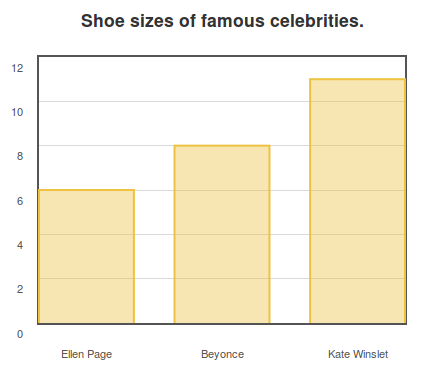
Below is an example of charting shoe sizes.
*chart: Shoe sizes of famous celebrities.
	*type: bar
	*data: [["Elliot Page", 6], ["Beyonce", 8], ["Kate Winslet", 11]]
The above program will display a bar chart that looks like this:
It's important that you start your *data keyword with one pair of square brackets that will go around everything (e.g. *data: []). After that, you can fill the initial square bracket with each datapoint you want to plot, also in their own square brackets: *data: [["item 1", 30], ["item 2", 40]]
Using Simple Variables with *data🔗
Look how our previous code could change if we instead used a couple variables in our data.
>> elliot = "Elliot Page"
>> Bshoe = 8

*chart: Shoe sizes of famous celebrities.
	*type: bar
	*data: [[elliot, 6], ["Beyonce", Bshoe], ["Kate Winslet", 11]]
The above program would display the exact same chart as the one we made earlier. Here you can see the data keyword contains two variables, elliot and Bshoe. You can substitute pieces of your data collection for variables, so long as you defined those variables previously in the program using the *save keyword or >>, like we did above. Note that when using variables, you do not need quotes (like how the variable elliot when used after the *data keyword, does not have quotes around it).
For a refresher on variables, click here.
Using a Variable of a Collection with *data🔗
We could also use more complex variables in our data. Check out this example now. It produces the exact same chart.
>> elliot = ["Elliot Page", 6]
>> beyonce = ["Beyonce", 8]
>> kate = ["Kate Winslet", 11]

*chart: Shoe sizes of famous celebrities.
	*type: bar
	*data: [elliot, beyonce, kate]
Here you can see that the variable elliot is now itself a collection. We can substitute the variable elliot (as well as beyonce and kate) right after our *data keyword to produce the same chart we had before.
Using a Variable of a Collection of Collections with *data🔗
One final example:
>> elliot = ["Elliot Page", 6]
>> beyonce = ["Beyonce", 8]
>> kate = ["Kate Winslet", 11]
>> Celebrity_Shoes = [elliot, beyonce, kate]

*chart: Shoe sizes of famous celebrities.
	*type: bar
	*data: Celebrity_Shoes
This again produces the same chart we showed you earlier. Now, after the *data keyword, is a variable that represents a collection of collections. You can see how the variable Celebrity_Shoes was defined as a collection of the variables elliot, beyonce, and kate.
Now you've seen three ways to use variables with the *data keyword. You can mix and match all different types of variables or non-variables to produce your charts in a way that is most convenient for you.
Setting the *min and *max Values of Your *xaxis and *yaxis🔗
By default, the x- and y-axis of a chart will stretch to a size relative to the largest and smallest bits of data you're displaying.
You can customize the size of your chart, though, with ease. For instance:
*chart: Your test results
	*type: bar
	*data: [["Your score", score], ["Average score", 65]]
	*yaxis
		*max: 80
		*min: 20
This is useful when you have very specific ranges you would like to display.
Adding a Pretty Chart *color🔗
Splash up your graphical displays with some color.
To start, you can find your favorite color from this website: http://colours.neilorangepeel.com
If you are looking for a palette that is friendly to colorblind people, check out this page: https://sashamaps.net/docs/resources/20-colors/
Copy down the RGB code. For example, if you're a fan of peachpuff, the code you want looks like this: rgb(255, 218, 185)
When you've got your fav, you simply add it to your chart's *data using the *color keyword, like so:
*chart: Got peachpuff in your life?
	*type: bar
	*data: [["bar 1 label", 4], ["bar 2 label", 5], ["bar 3 label", 6]]
	*color: rgb(255, 218, 185)
In this example, we're only using one color, not six. We'll get to adding multiple colors in a bit.
If you want boring colors like solid "blue" or everyday "red", then you don't need the RGB. You can just type *color: blue. This will work for many of the basic colors, and a few of the more creatively named.
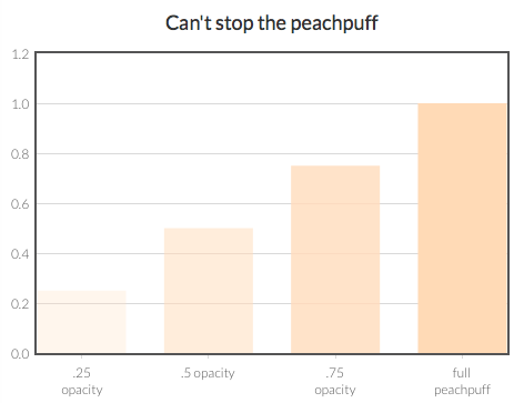
If you like the color you have, but it's a little too intense, you can add *opacity to make it somewhat see-through, like this:
*chart: Seeking less peachpuff in your life?
	*type: bar
	*data: [["bar 1 label", 4], ["bar 2 label", 5], ["bar 3 label", 6]]
	*color: rgb(255, 218, 185)
		*opacity: 0.5
Opacity should be a number ranging from 0 (totally see through) to 1 (totally solid). Here's how peachpuff looks with different levels of opacity:
If you have a custom color you want to use, go for it. The *color keyword will work with any RGB, not just the ones listed on the website above.
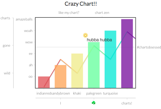
Multiple colors and multiple *data keywords🔗
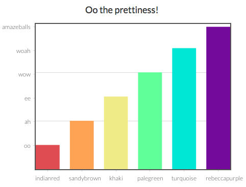
Now let's return to colors. Remember my chart earlier? With all the super awesome colors? The key to this snazziness is using multiple *data keywords. Each *data keyword gets its very own *color keyword.
If you just indent *color: yourColorHere beneath the *chart keyword, that color is going to apply to the entire chart. If you want to be more specific, then you've got to be more specific with your indents. Check out the below code and see what I mean:
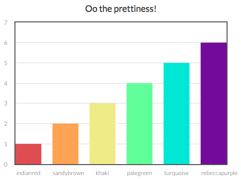
*chart: Oo the prettiness!
	*type: bar
	*data: [["indianred", 1]]
		*color: rgb(205, 92, 92)
	*data: [["sandybrown", 2]]
		*color: rgb(244, 164, 96)
	*data: [["khaki", 3]]
		*color: rgb(240, 230, 140)
	*data: [["palegreen", 4]]
		*color: rgb(152, 251, 152)
	*data: [["turquoise", 5]]
		*color: rgb(64, 224, 208)
	*data: [["rebeccapurple", 6]]
		*color: rgb(102, 51, 153)
Instead of lumping all my data points into one *data keyword, I split them up, so that I could then apply a unique *color attribute to each *data point.
The outcome to the above code will look like this:
If you want mostly light blue bars, with just one vibrant orange, then you do this:
*chart: This 'lil chart of mine
	*type: bar
	*color: lightblue
	*data: [["Fact 1", 12], ["Fact 2", 4], ["Fact 3", 3]]
	*data: [["Super emphasized Fact 4", 18]]
		*color: orange
	*data: [["Fact 5", 7], ["Fact 6", 5]]
The "lightblue" becomes the default color for all the bars, because it's indented beneath the *chart keyword, but the color for the fourth bar is overridden with an orange color.
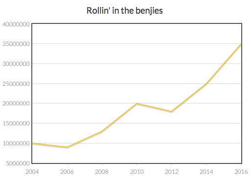
Add *ticks to Customize the Look and Position of the Intervals on the Axes🔗
Charts with money are fun, but they're hard to read without $ signs. You can customize your x- and y-axes to say anything you want!
Like this:
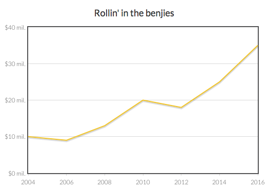
Here's how to do that:
*chart: Rollin' in the benjies
	*type: line
	*data: [[2004, 10], [2006, 9], [2008, 13], [2010, 20], [2012, 18], [2014, 25], [2016, 35]]
	*yaxis
		*ticks: [[0, "$0 mil."], [10, "$10 mil."], [20, "$20 mil."], [30, "$30 mil."], [40, "$40 mil."]]
The *ticks keyword lets you specify:
- the numerical value of where you want the tick to go, and
- the label you want to give that tick
So, the above example uses a collection of collections in the form:
[[number, label], [number, label], [number, label], ...]
In the case of *ticks, the value comes first and the label comes second. If the labels are just numerical, you don't need the label, you could just have something like *ticks: [2, 4, 6, 8, 10].
You can use *ticks for the *xaxis as well. For example:
Below, note that there are *ticks for both the *xaxis and the *yaxis:
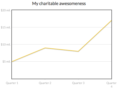
*chart: My charitable awesomeness
	*type: line
	*data: [[1, 5], [2, 9], [3, 8], [4, 17]]
	*yaxis
		*ticks: [[0, ""], [5, "$5 mil."], [10, "$10 mil."], [15, "$15 mil."], [20, "$20 mil."]]
	*xaxis
		*ticks: [[1, "Quarter 1"], [2, "Quarter 2"], [3, "Quarter 3"], [4, "Quarter 4"]]
You'll also notice that for the first *yaxis tick I used "" as the label, which means the label is just blank. This can sometimes be helpful for making your chart look a little smoother.
Multiple Chart Types on One Chart — and Multiple Axes on One Chart🔗
Let's say you want a line graph AND a bar graph on one chart, cause you're a chart maniac.
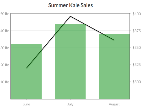
For example, you're a farmer charting how many pounds of kale you sold and how much money you brought in. You want your final chart to look like this:
To start, you have two different types of charts. You'll need to add multiple data keywords, one for each type of chart.
*chart: Summer Kale Sales
	*data: [[6, 32], [7, 44], [8, 38]]
		*type: bar
	*data: [[6, 320], [7, 396], [8, 361]]
		*type: line
In our code above, we've used the numeric values of the summer months (6 for June, 7 for July, 8 for August). We've also indented the *type keyword beneath each data keyword to specify how to display the data. We're showing the pounds sold as our bar graph data and the income made as the line graph data.
This code results in a pretty ugly chart though:
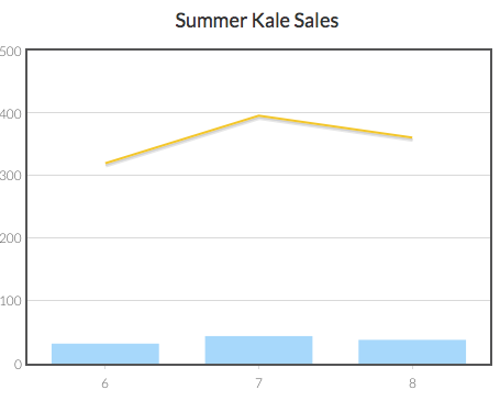
More work is needed! The number of pounds sold ranges from 32 to 44, while dollars earned ranges from $320 to $396. Each data type will need its own *yaxis for good chart chemistry.
We can have multiple y-axes and/or multiple x-axes. We just have to be sure to give each a name, and then link their name beneath the data they serve. We also have to tell the program where to *position each axis: on the left, right, top, or bottom, like so:
*chart: Summer Kale Sales
	*data: [[6, 32], [7, 44], [8, 38]]
		*type: bar
		*yaxis: pounds
	*data: [[6, 320], [7, 396], [8, 361]]
		*type: line
		*yaxis: dollars
	*yaxis: pounds
		*position: left
	*yaxis: dollars
		*position: right
In this code, we're making sure GuidedTrack knows that the *yaxis we want to use with the bar data is the one called "pounds" and the *yaxis we want to use for the line data is called "dollars." To make it clear, you indent the name of the associated axis beneath the *data it serves. You can call your axes anything.
Next, if you have multiple axes of the same type (e.g., two y-axes), you should specify their *position. In this case, we want the pounds' *yaxis to be on the left side of the chart and the dollars' *yaxis to be on the right side of the chart. As you can see above, the last four lines of our code are geared toward defining the *position of each *yaxis. When adding special details about an axis, you first indent the name of the axis beneath the *chart keyword, on the same indentation as a *data keyword.
You never include the *position, *ticks, *min, or *max of an axis beneath a *data keyword as in the below example.
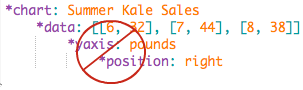
To correct the above example, you would make the *yaxis keyword on the same indentation as the *data keyword, and move the *position keyword one indentation leftward as well. That's because axes are attributes of the entire chart, and it's possible that multiple *data keywords could share the same *yaxis or *xaxis information.
Okay, now our chart looks like this:
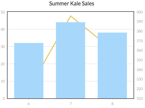
Getting better! But still not great... Let's change the *ticks on the y-axes so they're more clear...
*chart: Summer Kale Sales
	*data: [[6, 32], [7, 44], [8, 38]]
		*type: bar
		*yaxis: pounds
	*data: [[6, 320], [7, 396], [8, 361]]
		*type: line
		*yaxis: dollars
	*yaxis: pounds
		*position: left
		*ticks: [[10, "10 lbs"], [20, "20 lbs"], [30, "30 lbs"], [40, "40 lbs"], [50, "50 lbs"]]
	*yaxis: dollars
		*position: right
		*ticks: [[300, "$300"], [325, "$325"], [350, "$350"], [375, "$375"], [400, "$400"]]
This is the same code as before, except now we've specified how we want the labels to read.
The light gray horizontal tick lines that appear on the chart will only originate from the data of one axis, not both. For the second axis, you just have to add labels wherever you'd like them to appear.
Now our chart looks like this:
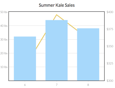
That's pretty good! New *ticks for our *xaxis and some colors would improve things though. Plus, it's hard to see the lines through the bars, so we should add some *opacity.
If we set the *min for the *yaxis: dollars to 275, that would also align the dollar values with the gray tick lines connected to the pounds, which would look swell!
*chart: Summer Kale Sales
	*data: [[6, 32], [7, 44], [8, 38]]
		*type: bar
		*yaxis: pounds
		*color: green
			*opacity: .5
	*data: [[6, 320], [7, 396], [8, 361]]
		*type: line
		*yaxis: dollars
		*color: black
			*opacity: .75
	*yaxis: pounds
		*position: left
		*ticks: [[10, "10 lbs"], [20, "20 lbs"], [30, "30 lbs"], [40, "40 lbs"], [50, "50 lbs"]]
	*yaxis: dollars
		*position: right
		*ticks: [[300, "$300"], [325, "$325"], [350, "$350"], [375, "$375"], [400, "$400"]]
		*min: 275
	*xaxis
		*ticks: [[6, "June"], [7, "July"], [8, "August"]]
This final code generates the image we started this section with. For a reminder, it looked like this:
With our code, we didn't need to specify a name for the *xaxis, because there's only one. If we wanted to though, we could add more. One at the top too. We could even add multiple x-axes at the bottom! We could have 6 y-axes and 7 x-axes just because we were feeling crazy!
Scatter Plots🔗
The code for making scatter plots works similarly to bar charts. The main difference is that you set the *type of the chart to "scatter" as in the example below. Your data should be organized in this general format: *data: [[x1, y1], [x2, y2], [x3, y3], [etc...]]
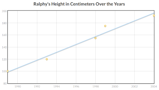
*chart: Ralphy's Height in Centimeters Over the Years
	*type: scatter
	*data: [[1989, 100], [1993, 120], [1998, 155], [1999, 175], [2004, 192]]
In our example, there are five data points. Each data point is surrounded by [brackets]. The value of the x-axis is written first (in our case, that's the year) and second is the y-axis (e.g., centimeters). Commas separate the values within each data point and they separate data points from each other. Additional brackets surround the entire dataset.
Variables can be substituted for any parts of the data, similarly to how we illustrated in the bar chart example.
The other keywords mentioned, such as *ticks, *color, etc., can also apply to scatter charts. Below is an example with *min and *max keywords added to both axes:
*chart: Ralphy's Height in Centimeters Over the Years
	*type: scatter
	*data: [[1989, 100], [1993, 120], [1998, 155], [1999, 175], [2004, 192]]
	*xaxis
		*min: 1980
		*max: 2000
	*yaxis
		*min: 50
		*max: 200
Using the *rollovers Keyword with Scatter Charts🔗
You can add optional text values to a scatter charts so that when users hover their mouse over any of the above data plots, a small box pops up with additional information. Here's how the code looks:
*chart: Ralphy's Height in Centimeters Over the Years
	*type: scatter
	*data: [[1989, 100], [1993, 120], [1998, 155], [1999, 175], [2004, 192]]
	*rollovers: ["Toddler", "First year of school", "HS Freshman", "HS Sophomore", "College Freshman"]
In the chart that this example produces, when users hover their mouse over the 1993 data point, it reads, "First year of school." (You can try this example out yourself here.)
The *rollovers keyword is optional. If you include it, you must have as many entries as there are data points.
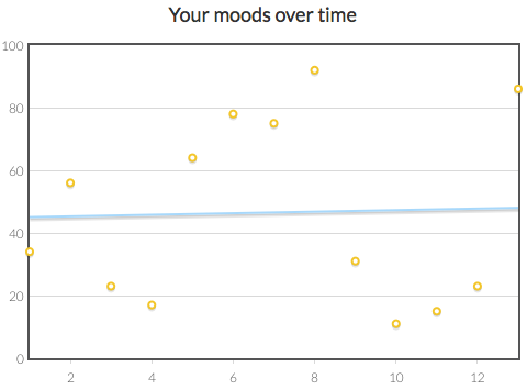
Adding a *trendline to Scatter Charts🔗
By adding the *trendline keyword, you can show whether your data trends upward, downward, or just flat.
Trendlines don't appear by default. To add a trendline to your graph, use *trendline, like this:
*chart: Your moods over time
	*type: scatter
	*data: MoodData
	*trendline
Trendlines look something like this:
Line Graphs🔗
Let's say I want to chart how my millions of dollars have grown over time (cause I'm saving for a yacht big enough to hold my helicopter).
I can use a line chart like this:
As you can see in the example below, the syntax of a line graph is pretty similar to the scatter and bar charts, the main difference is that in this case, *type is line:
*chart: Rollin' in the benjies
	*type: line
	*data: [[2004, 10000000], [2006, 9000000], [2008, 13000000], [2010, 20000000], [2012, 18000000], [2014, 25000000], [2016, 35000000]]
The line graph is also compatible with all other keywords mentioned in the bar chart example, such as *ticks, *min, *max, and *color.
Next: Clearing the screen