 GuidedTrack Docs
Components🔗
The *component keyword gives you the ability to put things in boxes, and optionally make them pretty and clickable:
Simple *component🔗
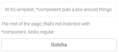
Above, a *component keyword was added to the first sentence. It's not clickable, but it's nice if you want to distinguish some content using a box.
The code for adding a simple box around things is:
*component
	It's my stuff in a box!
Multiple lines can be indented beneath *component (following the same level of indentation), allowing images, videos, stories, and more to be contained within a single box.
You can also have multiple components on a single page.
If you're an HTML or CSS whiz, *component puts the content inside of an HTML <div>...</div> tag, making it easy to style it as a group.
Clickable *component🔗
To make a component clickable, add *click:
*component
	You can click me!
	Really, it's true!
	*click
		Then after the click, here's what I'll do.
		*question: I'll ask you a question.
		*question: Or maybe two.
Above, users can click the box. If they do, they'll be asked the two questions in sequence. When they finish answering questions, they will return to the same screen that originally contained the *component. The whole page will then have its code rerun once the *click is complete.
You could instead redirect users by adding a *goto or *switch keyword as the last part of the *click.
If users don't click the box, that's okay; they'll still see the content that follows after *component.
Making a *component clickable makes the box border a darker color, as the next image shows.
Clickable *component with locally scoped data🔗
Suppose you have a collections of associations, each association contains the name and age of all your friends:
>> people = [{"name" -> "Peter", "age" -> 24}, {"name" -> "Josh", "age" -> 37}]
The size of this collection can change, as you have a module in your program to add or remove friends.
You can dynamically generate the components using the following code:
*for: person in people
	*component
		*header: {person["name"]}
On each iteration of the *for loop, we retrieve an element from the list of friends (the association of data about a person), save it into the variable person and generate a component that displays the value of the key “name” for that association.
Now let’s make these components clickable! Since the code under *click gets executed only when the user of your program clicks on a component in particular, we use the following syntax to be able to retrieve each person’s data:
*label: people
*for: person in people
	*component
		*header: {person["name"]}
		*with: person
		*click
			Name: {it["name"]}
			Age: {it["age"]}
			*button: Back
			*goto: people
We use the keyword *with to tell GuidedTrack what variable it needs to store for when the user clicks on the component being generated. We can use any type of variable: in this case, person is an association. Afterward we access that data in the code indented under *click by invoking it, as shown on the example.
Note that you cannot access the name of the person whose component you have clicked by typing Name: {person[“name”]} because, as mentioned before, the code under *click gets executed when the user clicks on the component. This can only happen after all the components have been rendered, so person by then will contain the data of the last person in the collection of friends (since that is what person ends being assigned to in the last iteration of the loop).
Nested *component🔗
Components can be placed inside of components.
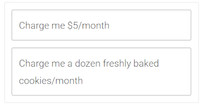
In the above example, there are two components inside of one and both are clickable (hence the darker border around the two inner boxes). The code to have these two clickable, nested components is:
*component
	*component
		Charge me $5/month
		*click
			Alright!
			*program: Charge money

	*component
		Charge me a dozen freshly baked cookies/month
		*click
			You got it!
			*program: Charge cookies
You can use nested components to allow users to click one of several, optional activities. This is like designing your own custom buttons that look and behave the way you want.
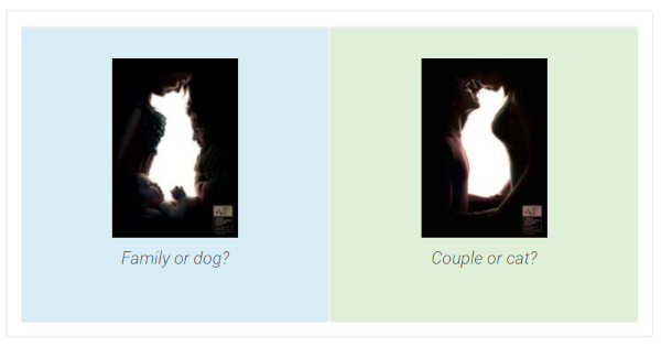
*component made pretty using CSS🔗
Components can be made about as pretty as your imagination and CSS programming skills allow, using *classes.
The image at the top was made using the following built-in Bootstrap CSS classes:
*component
	*classes: row

	*component
		*classes: col-sm-6 bg-info
		*image: https://i.imgur.com/MMUf2eat.jpg
			*caption: Family or dog?

	*component
		*classes: col-sm-6 bg-success
		*image: https://i.imgur.com/25KIrSmt.jpg
			*caption: Couple or cat?
If you embed your program on another website, and you've got some bonus skills, then you can add custom CSS stylesheets and classes to make your components especially eye-pleasing.
Next: Date / time features